Metro Myanmar Bank
The digital face of a new challenger bank — sequencing trust.
A new bank, asking for trust on day one.
Metro Myanmar Bank is Myanmar's first digitally-native challenger bank, operating under the KMA Group of Companies — backed by Standard Chartered Bank and FairPrice Group. The bank was already established. What they needed was a website landing experience that matched the ambition of the institution behind it.
I worked on this project as part of my role at KMA Group, leading the design of the marketing website. With the bank entering a market where digital financial trust was still being built from scratch, the site had one job: make MMB feel credible, modern, and worth choosing — before a single account was opened.
The challenge wasn't aesthetic. It was about sequencing trust. A new digital bank asking people to deposit their money needs to earn confidence before it earns clicks. The design had to do that work silently — through layout, hierarchy, and every micro-decision in between.
What had to be balanced.
Credibility vs. approachability
Backed by Standard Chartered and FairPrice — institutional weight. But targeting modern, digital-first users who don't want the cold formality of legacy banking.
Product complexity vs. simplicity
Multiple deposit types, multiple loan tiers, personal and business segments. All had to fit a single landing page that didn't overwhelm.
Present vs. future
MMB had to launch with confidence about products that didn't fully exist yet — Metro Pay, cards, internet banking. The design had to communicate momentum without overpromising.
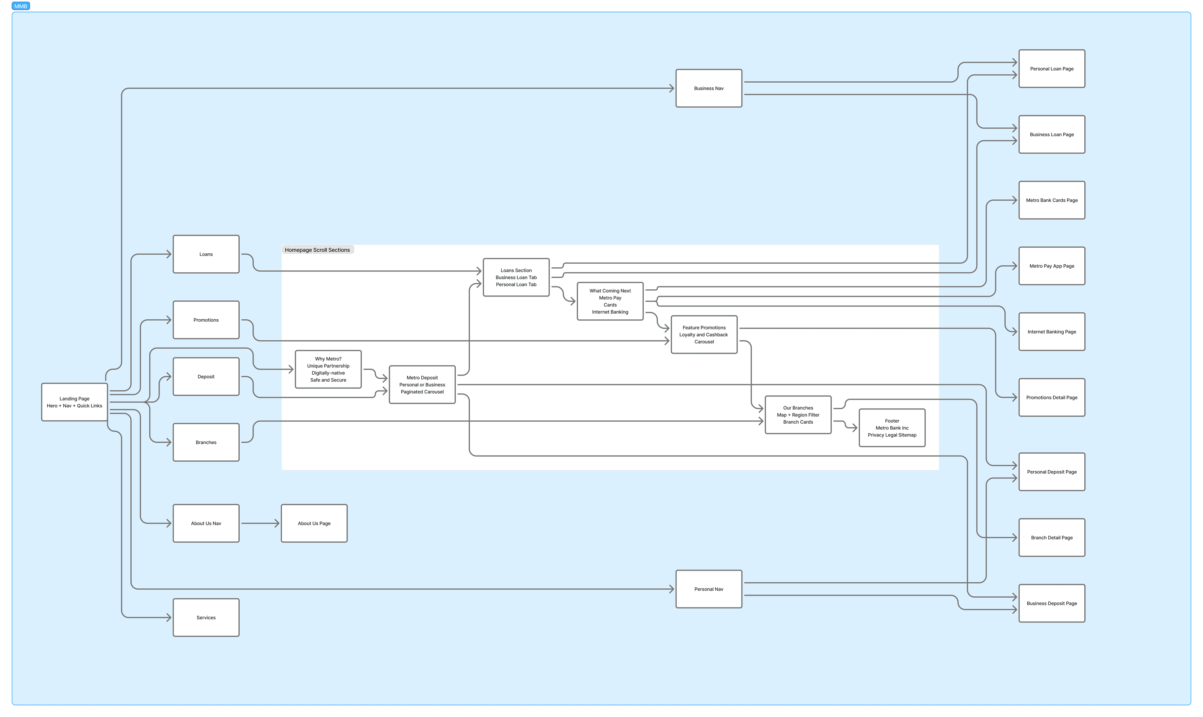
The order matters.
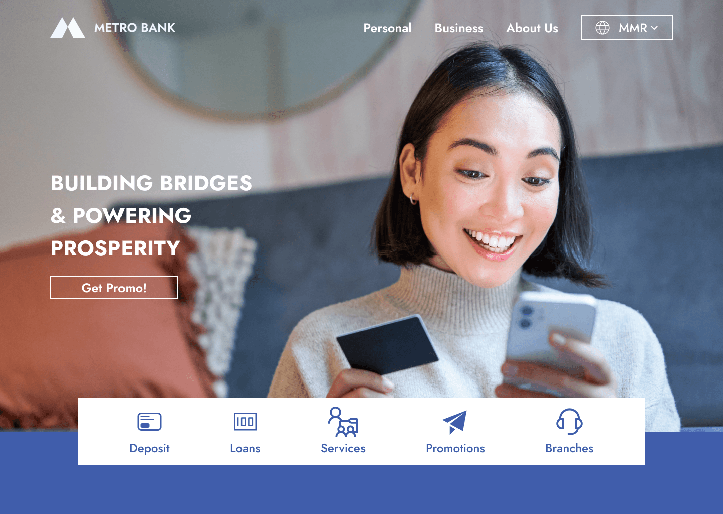
- 01Hero — establish the brand promise
Full-bleed photography with the tagline "Building Bridges & Powering Prosperity" anchored top-left. A quick-nav bar rendered in MMB blue sits at the base of the hero, acting as a visual platform.
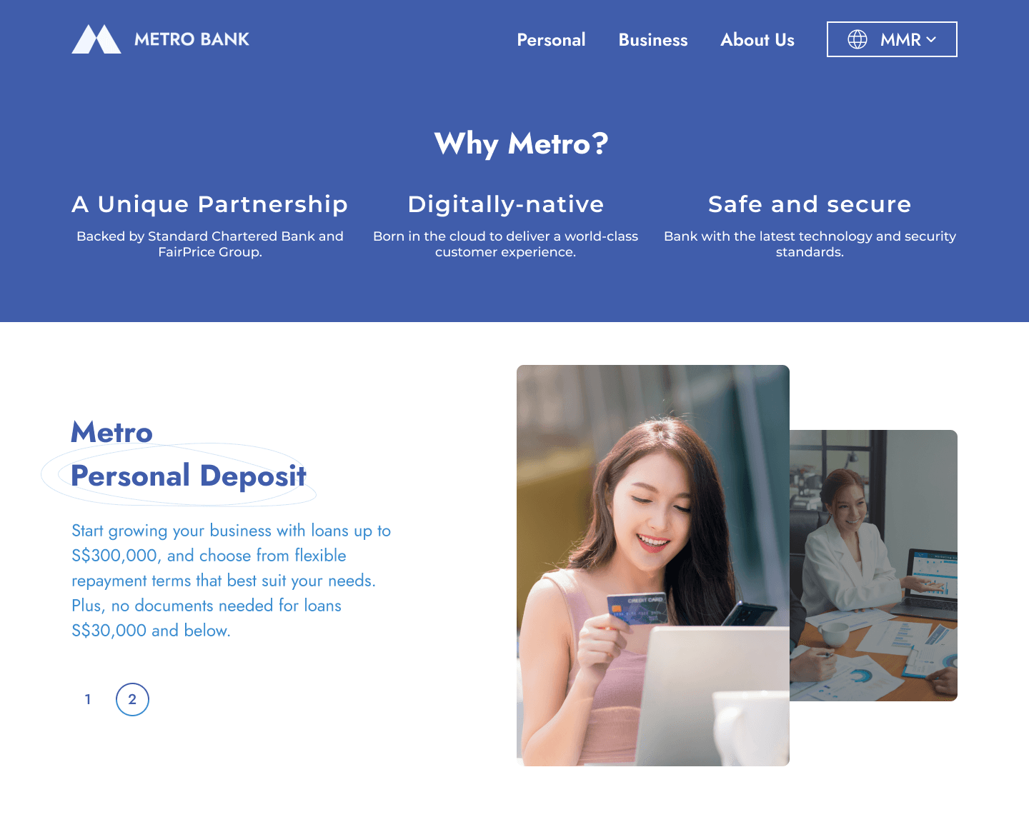
- 02Why Metro? — earn belief before asking
Three trust pillars — Unique Partnership, Digitally-native, Safe and Secure — placed as the second section. Before any product is mentioned.
- 03Products — depth once credibility is established
A tabbed comparison for Personal and Business deposits in a single component. Loans surface monetary anchors immediately — exactly what high-intent borrowers need to see first.
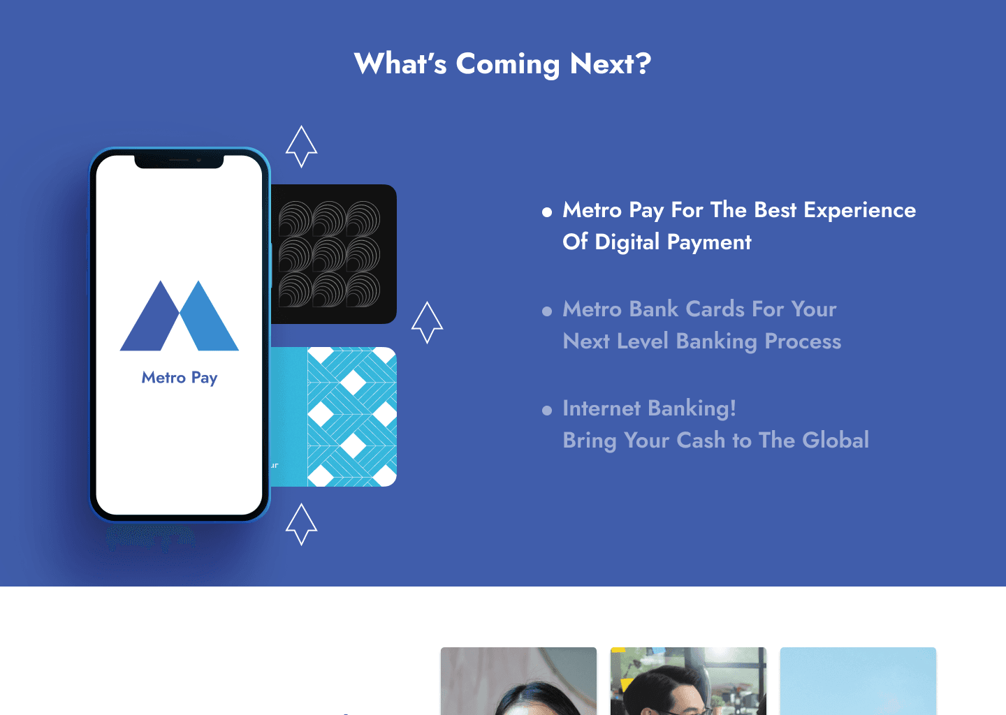
- 04What's Coming Next? — turn bounces into bookmarks
Metro Pay, Bank Cards, Internet Banking are named explicitly with their own scroll section. Users who arrive looking for features that don't exist yet leave knowing they're coming.

A bank website isn't a brochure. It's the first handshake. Every design decision either builds confidence or quietly erodes it.