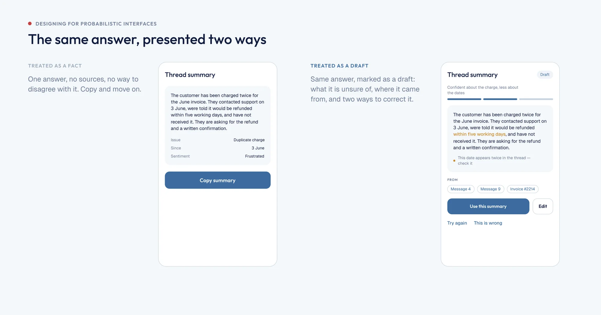
Calculator thinking vs. chat thinking
Every interface I learned to design was deterministic. Tap the button, get the result. Tap it again tomorrow, get the same result. The whole craft of states assumed that.
AI features break that assumption. The same input can produce a different answer, a slower answer, a confidently wrong answer, or no answer at all. You are not designing a screen anymore. You are designing a range.
A calculator is a promise: press seven, get seven. A model is a bet. Users arrive with calculator expectations and the product rarely tells them otherwise, which is where most of the disappointment comes from.
You are not designing a screen anymore. You are designing a range of outcomes.
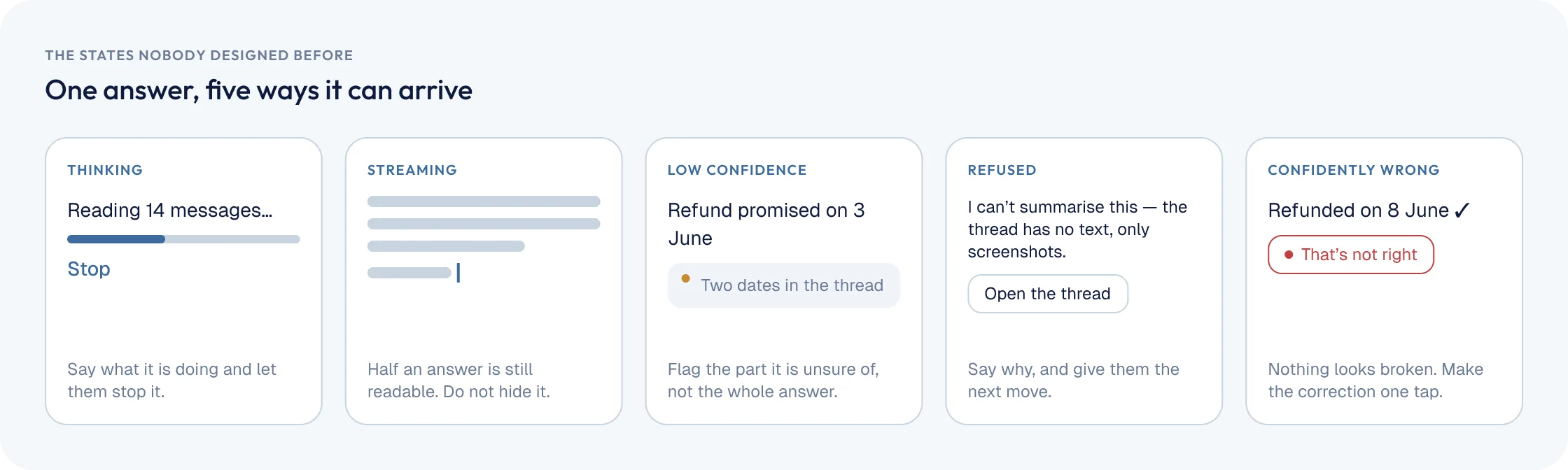
The states nobody designed before
- Thinking. Longer than a spinner deserves, shorter than the user will tolerate silently.
- Streaming. Partly right, still moving, already being read.
- Low confidence. The model answered, but it should say so.
- Refused. It will not answer, and the user needs a route forward.
- Confidently wrong. The hardest one, because nothing on screen looks broken.
Five patterns that hold up
Set expectations before the first run, not in an error afterwards. Show where an answer came from. Make every output editable rather than final. Make regenerating cheap and comparable. And give failure somewhere to go - a retry, a narrower question, a human.
The checklist I use
Before any AI feature ships, I ask: what does this look like when it is slow, when it is wrong, when it refuses, and when the user disagrees with it. If any of those four has no design, the feature is not done.